Create an Inspirational Vector Political Poster by Zach Wentz
This tutorial is inspired by Sheppard Fairey's famous political poster series for the Obama campaign in the US. We'll be showing you how to create this style of design. We'll start with basic image editing techniques in Adobe Photoshop to get our guide layers setup, and then we'll jump into Adobe Illustrator. You don't need any fancy equipment to do this. I used an older mouse that still has the rubber ball.
Editor's Note: Vectortuts+ does not endorse any particular political belief in the publishing of this tutorial. Rather, this tutorial is focused on demonstrating a workflow for creating this interesting aesthetic effect.
1. Crop and Modify Your Stock Image
Step 1
For this effect it is best to have a portrait style picture, preferably of a subject that appears to be thinking, or looking off into the distance. I used this photo from iStockphoto.
Step 2
Once you have your image, you need to Open it in Photoshop and Crop it appropriately. The top of the image should be cropped to the top of your subject's head, and the bottom should be a bit higher than chest height. The crop should have about a 2:1 ratio.
Step 3
Now we need to Posterize the image. Go to Image > Adjustments > Posterize. An appropriate posterization level for the look we are going for is 5.
Step 4
Now we're going to create our guide layers for use in Illustrator. Start by duplicating your posterized layer, and name this new layer "Pattern Guide." Then go to Image > Adjustments > Threshold. We're going to slide our Point until we get something similar to below. We want it fairly dark, but still with a small amount of detail. Also, when using Threshold, it is best to use the Peaks that you see.
Step 5
Save this newly created layer as "patternguide.psd," or something similar, as you'll need it for Illustrator.
Step 6
We need to repeat Step 4 and Step 5 three more times. Each time apply a lower threshold, and save each new layer. Below are the settings I used, again notice the peaks.
2. Setup Your Document and Palettes
Step 1
Before we start to outline our layers, we need to create the horizontal blue line pattern. To do this create a new Illustrator document. Give it a Height and Width of4px. Then create a rectangle filled with our light blue color (#4F919F), and cover the top half of the canvas.
Step 2
Cover the bottom half with a rectangle filled with beige. Then Select All (Control + A), and drag this over to our Swatches panel. Congratulations you've made a pattern!
Step 3
Now we have to save this Swatch set so we can use it in our poster we're about to make. In the bottom left corner of our Swatches panel we'll select Save Swatchesfrom the Swatches Library Menu. Name it anything you want, I used "pattern." You can now close this document, as we won't need it anymore.
Step 4
Here is the color palette we'll be using for this tutorial. There are four colors and a pattern. We'll be using a mix of beige and light blue colors.
3. Create Your Portrait
Step 1
Now that we have our reference images and pattern created, it is time to create aNew document in Illustrator. I used a canvas size of 700 x 850px.
Step 2
We're going to start with our darkest guide layer, this will be our pattern layer. We're going to outline the layer using the Pen Tool (P). So to start we're going to go to File > Place and select our first reference layer into Illustrator. If you've been following verbatim, this file to place is called "patternguide.psd".
Step 3
Let's stop for a moment and discuss the proper use of the Pen Tool (P) in Illustrator. This is one area where Illustrator handedly trumps Photoshop, but only if you use it correctly.
For any curve you basically have three clicks; two are anchor points, and the other is your curve point. You place your curve point at the highest point of your curve. You place the anchors at where the curve starts and ends.
One click is all that is needed when you are creating a curve. You can then change the curve points to curves after you have done the entire shape. To convert them use the Direct Selection Tool (A) and click on the Convert Selected Anchor Points to Smooth icon.
Step 4
Before we can outline our first layer, we need to load our pattern into the Swatches Library. To do this select Other Library from the Swatches Library menu in theSwatches panel.
Step 5
Okay, so back to outlining our first layer. Create New Layer below the file you just placed into Illustrator. This layer will hold our outline. We place it below because it is easier to see what we're outlining that way.
Now we grab our Pen Tool (P), give it a stroke of null, and a fill of our pattern. Then start outlining all the black areas with the Pen Tool (P). The key is to average it out, don't follow too closely to the guide layer. Just roughly outline, and don't worry about our curves, as we'll fix that after we create our outline.
Note: This is the most tedious part of the process.
Step 6
You might have noticed that there are portions in the middle that are lighter that we just went right over with outlines. Well we're going to fix that by outlining those using the same process. Fill those with our beige color, as shown below. We'll do this on a new layer just above the pattern layer. After you've done that, you should have something similar to the following.
Step 7
Now we smooth out the shapes we just created. We want most of our points to be smooth, but I find it looks better if you leave a few the way they are. View the effect below from smoothing both the pattern and beige layer.
Note: I made this image out of order and the pattern was wrong, don't worry about the color difference.
Step 8
Now we just do this same thing for each layer. Roughly outlining it, then outlining the highlights with the color immediately below it, and then smoothing out our outlines. The next layer should have solid light blue, followed by red, and then finally our dark blue.
Step 9
Okay, you should have something like the following. The tedious part is over. Now to make it look like a poster. First we'll put a beige filled rectangle below all these layers, this will serve as our background.
Step 10
Now we'll need to put our red and light blue halves in. We're going to do this just above the beige rectangle layer. Use the Rectangle Tool (M) to place the two rectangles.
Step 11
Our poster is looking pretty good. Let's create the space needed to add the inspiring text at the bottom. You'll probably have to enlarge your canvas area. To do this go toFile > Document Setup. I added 300px onto mine.
Step 12
Now extend you beige rectangle so that it covers the new length of your canvas. Then create a new rectangle filled with our dark blue color. It should be a quarter the size of main subject.
Step 13
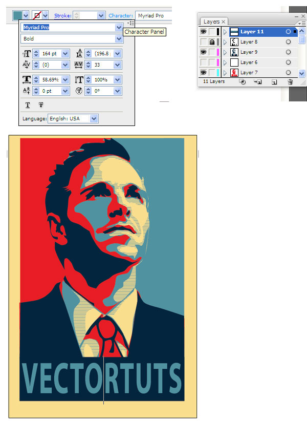
Time to add our inspiring word. We'll use light blue for the font color, and we want to change the text settings so that the word fills most of the dark blue rectangle. To change the spacing between the characters, use the Character panel. This is available to us when we are using the Text Tool (T). I used the font "Myriad Pro".
Step 14
Almost finished, we need to clean up our borders a little bit. First, select every layer, but your beige layer. Then create a Group (Control + G). Then Vertically andHorizontally Align them to the artboard.
Step 15
Now we're going to clean up the edges of our poster. Cover the layers that we grouped in a rectangle of any color. Then use the Pathfinder panel, and selectSubtract Shape From Area.
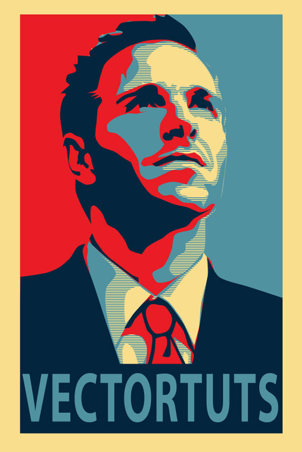
Awesome Work! You're Now Finished!
Way to go, we're done! We managed to create a really awesome effect without needing a whole lot of artistic ability. We also learned how to efficiently use the Pen Tool, and a nice way to use Photoshop and Illustrator in tandem. This is my first tutorial, so I'm sure there will be questions. Feel free to ask in the comments, and I'll try and answer as quickly as I can. Thanks!
Create an Intense Movie Poster in Photoshop by Alex Beltechi
Designers love to be critical about movie posters, and while you may think you have better ideas about how to sell a movie to an audience, how many times have you actually tried doing it? In this tutorial, we're going to create a poster for a fictional movie called "Fugitive." The movie is meant to be a suspenseful thriller that features one's escape under the cover of darkness, despite man's attempt to capture the lone hero. Thin and cheesy plot? Check. Awesome opportunity to better your PSD skills? You got it!
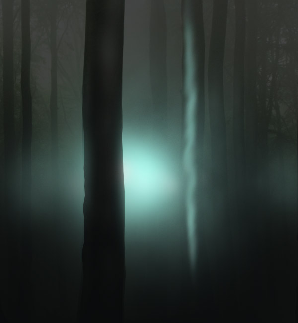
Final Image Preview
And here it is; the poster we're about to do! I could have just used a dark forest photo for the background, but where's the fun in that? This tutorial is not about finding the shortest route to an end, rather striking the balance between how real you want the setting to look, and cinematic/artistic at the same time. You want it be compelling and truthful, but also control the viewers attention and amount of information they're given. You don't want to spoil the movie, but entice someone to come see it.
Take a look at the poster we'll be creating.
Video Tutorial
Our video editor Gavin Steele has created this video tutorial to compliment this text + image tutorial.
Step 1
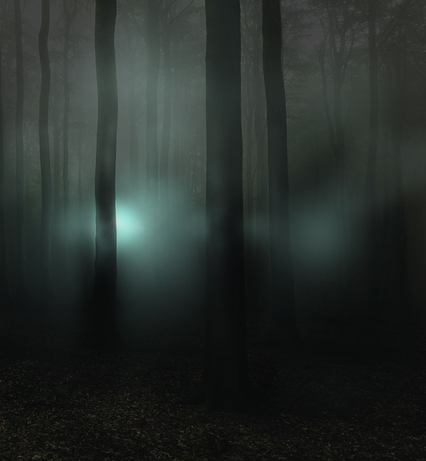
Let's start with the background. I used the largest available version of this photo, but just about any foggy forest image will do. Typically, we'd be working on an A4 or A3 canvas, but for the sake of spending less money on resources, we'll create a scaled down version of an A4 canvas. Not only that, but we're going to create a large background image that we will ultimately crop into a final movie poster. So for the first part, create a 1680 pixels by 1819 pixels at 300 dpi and paste in the forest image. Make a similar layout.
Step 2
We'll now add a series of Adjustment Layers to change the appearance of the photo. You can find them under Layer > New Adjustment Layer. The first one is a Hue/Saturation with Saturation set to -54.
Step 3
Next, add a Curves Adjustment Layer. Drag the curve as seen in the screenshot below.
Step 4
Now add a Selective Color Adjustment Layer. From the drop-down menu, select Blacks. Use the settings shown below.
Step 5
In this part, you need to establish a light source somewhere on the canvas. It's a good idea to add a dot where it will be so that you have a better idea of where the highlights and shadows appear.
From now on you're going to need a pen tablet. You can also do this with a mouse, but the pressure sensitivity makes all the difference. Use the Burn Tool (O) with Exposure set on 15% to darken the darkened portions of the tree trunks. See this before and after image for reference.
Step 6
Do this for each of the trees. Remember that the trees aren't perfectly flat, so keep the burn pattern "bumpy."
Step 7
Use the same settings but with a much larger brush size to darken the bottom of the photo.
Step 8
Now add highlights on the trees with the Dodge Tool (O). The larger highlight should be on the side of the light source. Then a second, thinner one consits in light that gets reflected from the surrounding objects and environment.
Step 9
Once you've finished all the highlights and shadows, use a soft brush to draw the light source as a faint, cyan glow.
Step 10
Erase portions of the glow that cover the more up-front trees.
Step 11
From the layer menu, click on the Add Layer Mask icon. Press D on your keyboard, then go to Filter > Render > Clouds. Then go to Filter > Render Difference Clouds. This will hide portions of the glow in an irregular, cloud-like manner. You can see this process in more detail at Step 17.
Step 12
On a separate layer, paint a stronger cyan glow.
Step 13
Lastly, paint a smaller white glow on a separate layer. If you make it too intense, lower the Opacity of the layer.
Step 14
The next job is to add some reflected light on nearby trees. Start by painting thin strips of color on a trunk.
Step 15
Use the Smudge Tool (R) to soften up the glow.
Step 16
Smudge it until it looks like in the screenshot below.
Step 17
Just like in Step 11, add a Layer Mask to the layer by clicking on the Add Layer Mask icon. Make sure you have the Layer Mask selected by clicking on its icon, then go to Filter > Render Clouds. To make the clouds have more contrast and better defined edges, go to Filter > Render > Difference Clouds.
Step 18
Repeat the process for all the nearby trees. The closer the light, the stronger the glow.
Step 19
Now create a new blank layer above all the other ones and create a few very faint spots on the canvas with the same cyan.
Step 20
Again, use a Clouds Layer Mask to hide portions of it.
Step 21
Now we're going to create an anamorphic lens flare. People are really quick to criticise the use of lens flares in digital work, and due to constant overuse, they're easy to hate. But the fact is that they do exist, and can be a great asset to a design. Rather joining a hate trend and condemming this effect, I suggest you study it and find ways to do it right!
Anamorphic lens flares appear from artifical light sources (such as fog lights) which are obviosuly very appropriate if you're trying to create the illusion that someone is being chased by people in the night. It also adds contrast and a focal point to the design, thus becoming a key element in telling the story of this poster.
Use a small, soft brush on low Opacity, hold Shift and draw a light streak from side to side that converges with the light source.
Step 22
Use the Pen Tool (P) in Path Mode to draw the new location for a secondary light streak.
Step 23
Choose the appropriate brush settings and with the Pen Tool active, right-click and go to Stroke Path. In the following menu, choose Brush and check the Simulate Pressure box, then press OK.
Step 24
Create three of these with different widths. You determine the width by choosing different brush sizes before stroking the path. You should create these three on the same layer.
Step 25
Command-click on the layer icon to make a selection of it or go to Select > Load Selection > OK.
Step 26
Use a large, soft brush on a light cyan color to give this detail a highlight.
Step 27
Add a few more thin lines at different sections of this beam of light.
Step 28
Next, on a separate layer add a simple dot of about 20 px with a hard edged brush. The go to Filter > Blur > Motion Blur and blur it until it looks like the one below.
Step 29
Now add a darker and larger beam over the other ones.
Step 30
Make a selection of it and give it a highlight too.
Step 31
Finally, add a soft, white glow in the center and to the side of the tree. Give it a low Opacity.
Step 32
Now we're going to alter the scene again, so that the light appears more realistic. On top of all the layers from the Layer Menu, create a Selective Color Adjustment Layer. Find the Cyans and use these settings, and don't press OK just yet.
Step 34
Find the Greens too, boost everything to max and press OK.
Step 35
Add a Channel Mixer Adjustment Layer and from the drop-down menu, select "Black & White with Green Filter." Press OK and set the layer's Blending Mode to Color Dodge and Opacity to 70%.
Step 36
On top of these, add another Selective Color Adjustment Layer and change the Cyans to the settings shown below.
Step 37
Add one more Channel Mixer on top, as shown below.
Step 38
And a final one (for now) - Levels Adjustment Layer.
Step 39
Your scene should now have a similar appearance to the one shown below.
Step 40
Now we're going to enhance the appearnce of the trees by giving them very thin reflective areas. See the three trees on the left? Thy all have a 2 px soft line drawn on the right side. Do the same for your trees with a dark cyan color.
Step 41
Repeat this process for all the trees. The farther the tree, the less prominent the line.
Step 42
Now on a separate layer, draw some pure white ones. Keep these shorter though, and fewer.
Step 43
You'll now need a medium size version of this photo. Position it in the composition.
Step 44
There are multiple ways to cut out this person, but the safest and most flexible way I use is to paint a Mask Layer with a tablet. Below is a black and white view of my Mask. Cut out your character as well, so that he only holds a branch in his hand.
Step 45
Position him underneath the Lens Flare details, and slightly to the right of the tree.
Step 46
We'll now match the character's darkest values to the scene by adding a Selective Color Adjustment Layer. Once you've dragged the Black value to -3, press OK and make it a Clipping Mask (Alt + Command + G).
Step 47
Next up is making the shadows. Create a new blank layer and draw shadows cast by the bright light with a near black color.
Step 48
It's finally time to create the actual poster! Like I said before, an A4 poster means a lot of pixels. You can use smaller resources to keep your budget down by creating a new document that keeps the proportion of an A4 format, but at a smaller resolution: 1024 px by 1449 px at 300 ppi. Copy a merged version of the scene (Command + Shift + C) and paste it in the new document. Position it as shown below.
Step 49
A crucial part of any movie poster is the movie title and its typface. I used what I think is a good reflection of the concept. The tall faces of ITC Franklin Gothic Book Extra Compressed complete the idea of being illusive, sharp and cunning. The flat look is there to balance the piece and make sure that the poster does not become overly photoshopped. The simple white appearance provides contrast for an otherwise dark poster.
It's what I think is appropriate, but what would you use? Speaking of overly used stuff, I give you "Trajan!" I'm really curious to see what typeface you would find fit, let me know in the comments what you think would work better.
Step 50
For a more cinematic look though, I decided to horizontally Motion Blur a duplicated version of the font.
Step 51
After you give it a Motion Blur, you'll notice that the top edges are pretty harsh. Soften them up a bit by adding a smaller blur on the vertical axis.
Step 52
Then just set the layer's Blending Mode to Pin Light and play around with the Opacity.
Step 53
A typical appearnce of text on movie posters is very large tracking, or spaces between the letters of each word. You know how poster sometimes have the phrase:from the creator of this-and-that movie? Well I gave this design a humorous slant on that.
Step 54
Another common phrase is based on actual events, or something like that. Below is this true tale.
Step 55
And finally, a few other details like the movie website, release date (in this case the day I finished the poster - wouldn't it have been cool for me to do this on the date of 09.09.09?) and movie producer logo.
Step 56
On the top layer, add one last (I promise) Adjustment Layer: a Channel Mixer where you slightly change the Blue values.
Step 57
To create the branches, we'll use a very cool brush set that you can find here. Paint a few branches on a layer that's underneath the Channel Mixer.
Step 58
Erase portions that you want to appear hidden behind the letters.
Step 59
Now use a 2 px white brush again to add the reflections. I think the branches are a lovely touch of detail, without compromising the message. After all, it would be strange for him to be hold the only thin branch in the forest, right?
Step 60
A final effect is a partial Motion Blur on the edges that is just right for giving a sense of urgency and motion. Press Q and with a large Black & White gradient, drag a radial gradient from the center to just a bit past one of the lower corners of the canvas.
Step 61
Make sure you have the background layer active and go to Filter > Blur > Motion Blur. Once you've done this, do the same for the branches, but add a bit more distance.
Advertisement
Step 62
And as a final touch, paint a few shadows for those branches over the letters. You can do that by painting with black in a new blank layer, making it a clipping mask for the letters and changing their Opacity to a low 15%.
Final Result
And the poster is now finished! I'd love to see your own movie posters, so be sure to put it in our Flickr group if you come up with something!
Here is a secondary version I made after the first one, in desktop format.